Practically Effective
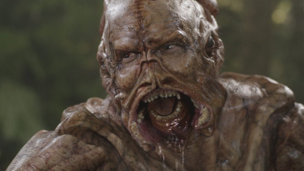
The addition of Digital Makeup in Falling Skies actually expanded the use of practical effects. I know that may shock some of you to read. In a time when computer Generated Imagery frequently replaces the practical world, this syndicated, wrapped series bucked the trend. Practical makeup artists used the computer as one of their tools, not a visual effects studio, to improve what they made sculpting rubber and glueing it to actors.
This series, the Digital Makeup Chronicles, explores these effects, and discusses how practical and digital worked in tandem.
After all, it is not every day you get to do something different.
A Little Hemlock
In 2014, the Digital makeup Effects team (dMFX) at MastersFX Studios mildly stunned everybody with a practical/digital hybrid werewolf transformation for the second season of Hemlock Grove — following up on a successful all CGI version the year prior by a traditional VFX studio. The transformation relied heavily on practical elements to provide “reality” to the effect, while using digital tools to “glue” them together with live actors. The sequence was nominated for a Visual Effects Society award, and showcased an unusual choice in the current climate of Computer Generated Imagery: to eschew CGI as much as possible. It is a bit of an odd approach these days, and a complete turnaround from decades ago — where every effect was practical, and the digital tools were brought in to do the special trick — we were turning that around. In this case the special trick was the practical effect, and the power of digital compositing, CGI, and 3D tracking were the current standard. It was definitely kicking against the trend.
Well, we kept kicking.
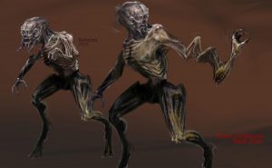
The fourth season of Falling Skies introduced a new species of alien/human hybrid — only seen in a mutant early stage (some of the design work here.) The more advanced version of this creature, reserved for Season Five of the series, was coalesced from these designs, and introduced as a new character created by the alien invaders (and the artists at MastersFX.) This character became another showcase for the methods introduced in Hemlock grove.
His name is Brian. This is his story:
All About Brian
The design for Brian was undoubtedly alien. He was to have thin digit-style legs like a deer, Skitter-like feet (another character in the series with 6 legs), and an elongated head, with human teeth and mandibles mixed together. Lest we forget to mention, there was also a spring loaded stretchy arm that could reach out 12 feet to grab things. Yes, 12 feet.
It would be difficult to find an actor that could fit a costume like that on-set, so one immediately thinks “break out the computer generated character, call all your animator friends, and fix it in post!” However, Falling Skies is known for its use of practical creatures, both as a cost savings, but also as a way to bring more believable characters to the screen.
Previous seasons introduced the character of Cochise, who was initially a full-CGI construct, but due to the dMFX research tests at mastersFX, were created practically on actor Doug Jones, and then later augmented with complex image warping methods to complete the performance the actor was delivering through an inch of foam rubber. This was covered in more detail in the previous article The Unwanted Rise of Digital makeup. The lighting and framing of the original Director of Photography, as well as the performance directed on-set remained in-tact, and the digital crew built what was difficult to achieve.
This video shows the level of performance the team was building with the “Cochise Rig,” which had evolved from the first season — improving mouth shapes, and driving eye movement from tracking, with some facial movement by multi-frequency sampling the Actor’s dialogue in conjunction with animation.
The original plan for Brian, was not that different from the Cochise method. A full body costume was created by the MastersFX team in Vancouver, and delivered to set. Worn by an actor/suit performer, and directed on camera. We would obviously have to replace some of his limbs in certain shots, and then we would warp his expression as before to provide better performance. As with all plans, they rarely survive the reality of production. After all the footage was filmed, and the sets wrapped, the request came in to open Brian’s mouth, because the actor could not open his mouth at all. So, the dMFX team had to open his mouth. Open his mouth very wide, and show us the monster teeth inside.
We had no monster teeth inside. Just an actor.
This is generally where CGI replaces a makeup effect, and Behind-the-Scenes videos claim how important it was to have all the time and money wasted to get accurate lighting reference. Would anybody really assume that all that effort is obviously necessary so that the actors could have something to look at, so their eyeline properly matched? “Actors hate acting to tennis balls,” we are told, and easily have no ability to imagine, one must imply from that statement. What is the general reason to replace the effect? Does someone at the table say: “But wait, now that the entire creature will be CGI, and the Director is gone, we can completely redesign the creature, and animate a different performance…How much will that cost?”
You see how it can quickly get out-of-hand. Especially on a television budget, and time scale (it is short.)
All right, not considering the made-up farcical example above, then what about partial CGI? We can exactly match the sculpture and movement of the actor, and just like replacing the CGI limbs, create CGI mandibles. Considering the number of days it will take to track the animation, build the model, texture the model, tweak shading and lighting to match, as well as simulate all sorts of slime to drip off the mouth… it would easily rival the costs of building the original costume! Why not try it practically? If the costs are similar, if not cheaper to build something practically, why not apply all the same technique used on Hemlock Grove, but months after the fact? The lighting and shading are handled during photography, as well as most of the animation — any inconsistency could be worked out in compositing. It might just work.
Building a Better Brian
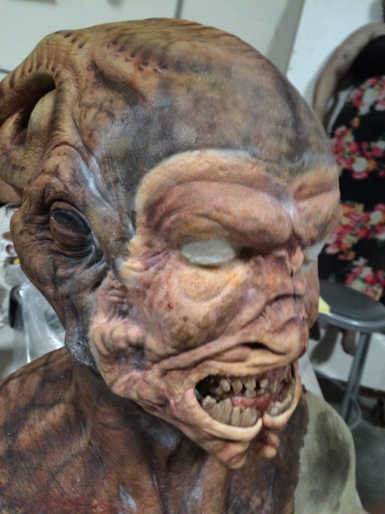
The paint master for the makeup was quickly shipped from Vancouver, where the series was filmed, to the shop in Los Angeles, where the majority of the dMFX work was done. At the same time, the dMFX team in Vancouver began 3D tracking and rotoscoping the shots so no production time was wasted. The paint master is a copy of Brian’s entire head, and is painted as a template for the MFX team on-set — it was immediately scanned into the computer with photogrammetry and 120 iPhone photos. Once a rough scan was complete, a new design for the mandibles could be quickly worked out in Pixologic’s Zbrush software.
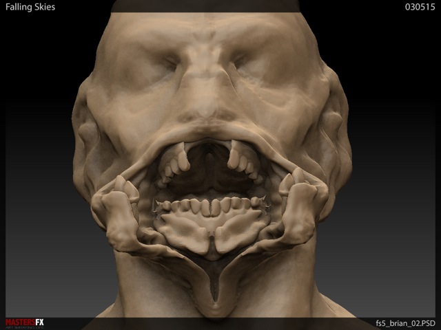
Here is a turntable of the design over rough photogrammetry. No need to clean it up, or build color maps — just had to get a design quickly approved, as there was little time.
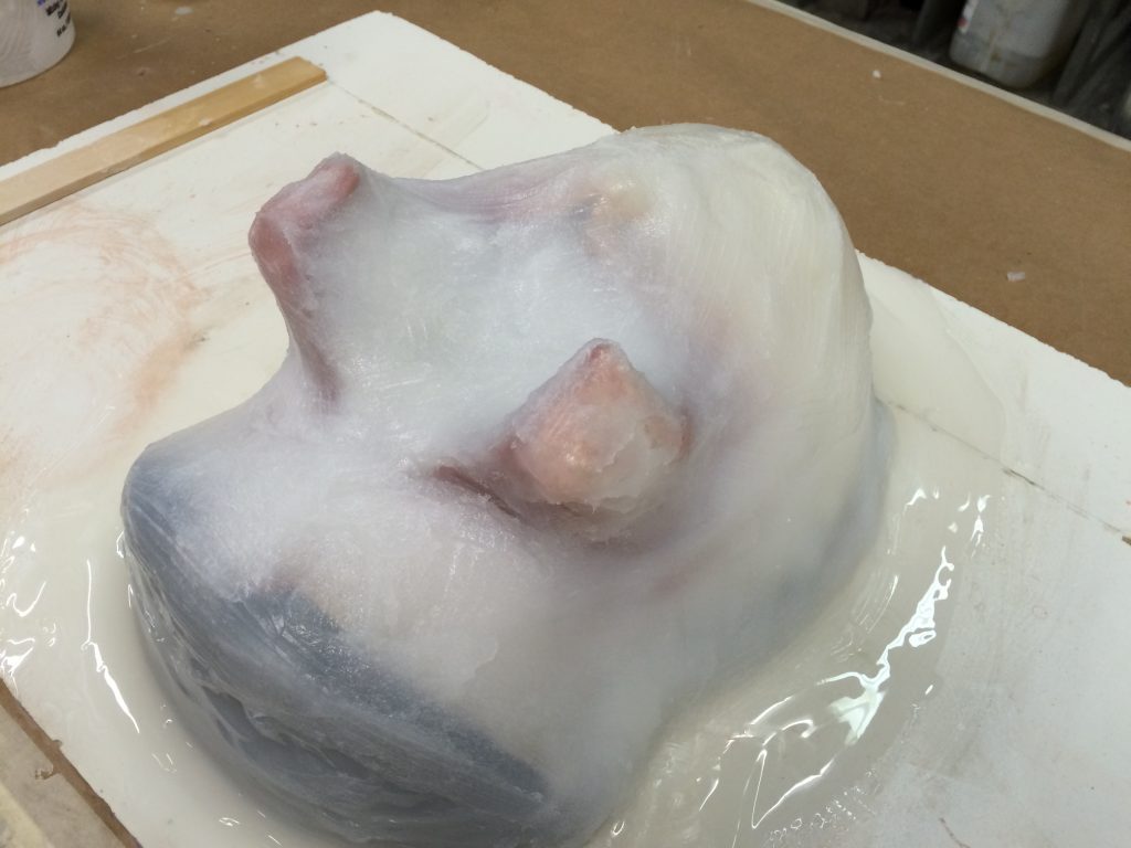
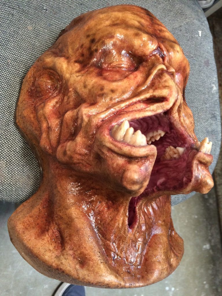
With the design approved, the MFX team led by Jason Ward made a copy of the paint master by pulling a new mold off of it. A thin layer of clay placed into the mold was used to pull a smaller plaster core, which was then vacu-formed in plastic to build a skull understructure. Clay was pressed out of the mold, placed over the plaster skull, and resculpted to match the approved design. That was then molded itself. With the clay removed, the two mold halves were placed back together and cast into a new skin out of silicone. The plastic skull was sliced up for movement, and simply articulated with mandibles and an insert acrylic jaw and teeth. The outer teeth were still made of rubber.
Photogrammetry was one of the newer tools the dMFX team utilized, as it allows for a quick, low-cost, portable scanning method that is capable of high quality results as good as 3D scanning. The photogrammetry pipeline was in development during the third season of the show, and quickly became one of the mainstays of the work. Previously we had to wait on a 3D scanning house, or model everything by hand. It was fairly simple to lock down the 3D tracking of the Brian makeup using the geometry as a snapping guide, but it was admittedly a rough scan. Eventually a 3D scan did arrive from the production, seemingly done before our plan was approved and they thought replacement was necessary. It was instead used to work out the model for the elongated limbs, as the costume ended at the actor’s knee and a pair of black stockings. Eventually the head portion was used to improve the 3D tracking as well, because of its high accuracy.
The guiding design for Brian had spindly, thin legs, but only two of them. One of the early designs I submitted for this character in Season Four tried to take account of all the limbs every other skitter has — six legs, and two arms. My design split the humanoid leg at the knee, growing two legs per femur bone, and stretching out the ankle leaving a vestigial human toe. (Sounds disgusting!) I proposed this in a couple of paint-over frames (Photoshop composites done over the editorial low-resolution footage.) I then modified the 3D scan in Zbrush, trying to make Brian more alien.
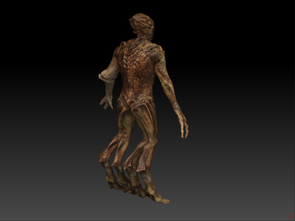
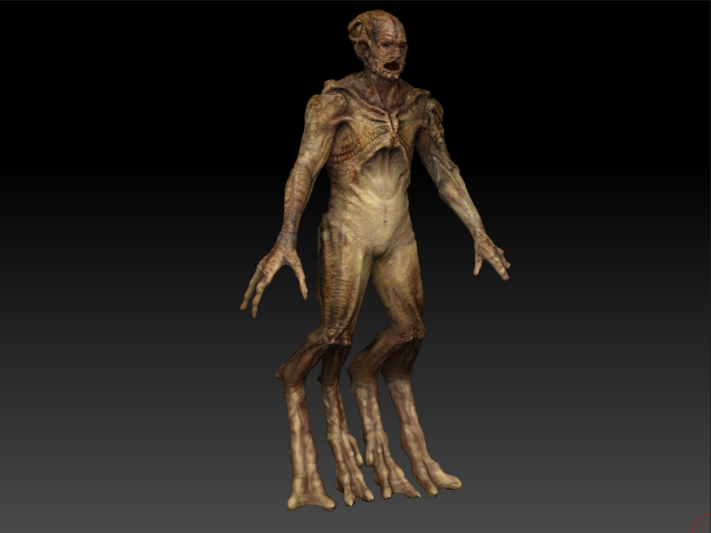
Here Brian is posed. Lots of stretching in the body, but this was just for the feet.
Picturing Brian
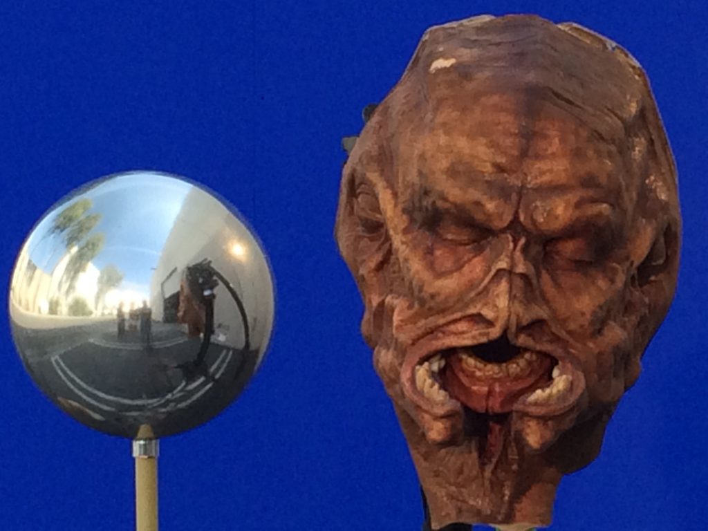
At long last it was time to photograph the elements for the individual shots. Andre Bustanoby, had worked out the camera angles and lenses from the 3D tracking of the actor in-costume, and derived the basic lighting pattern from chrome spheres that were photographed on-set. Several tests were conducted before the shoot comparing blue screen vs green screen, and it was determined that the Canon Mark V camera responded better, and had fewer artifacts shooting a blue screen — as that color actually has some contamination in the other color channels, it is less likely to cause a video tear. Green screen at times is so pure, that on video it leaves black holes in other color channels, when what you want is a more neutral tone. So these tests were critical.
Special versions of each photographed plate were built using the 3D tracking. Each shot was stabilized at the center of Brian’s head, so that all we saw were the small movements the original actor performed, rather than the very large movements across frame, or toward camera that we would provide later.
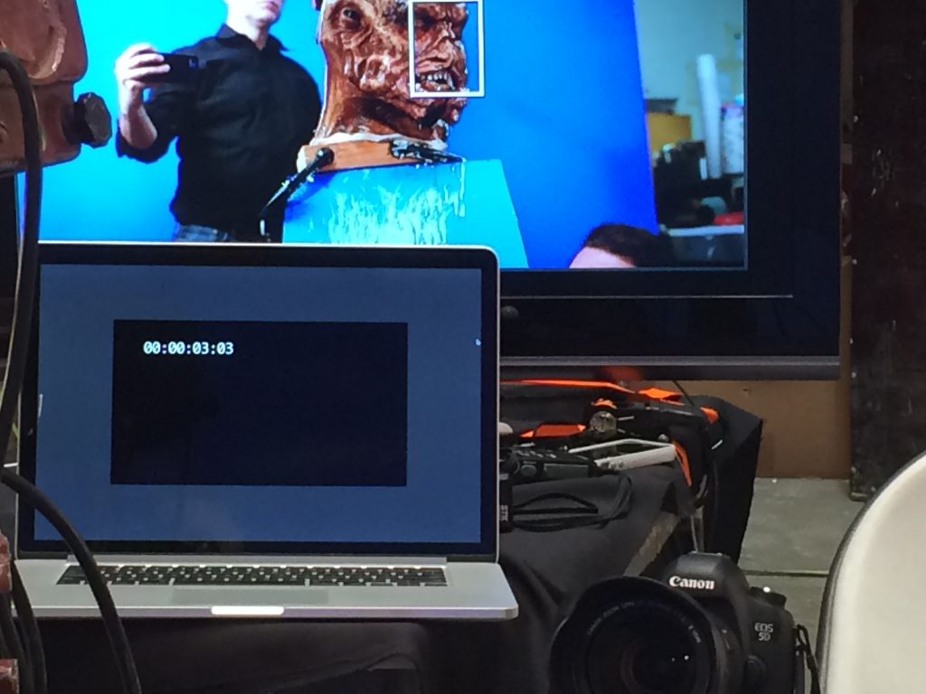
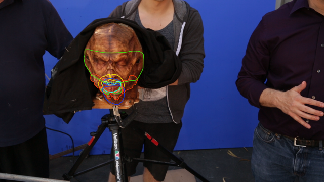
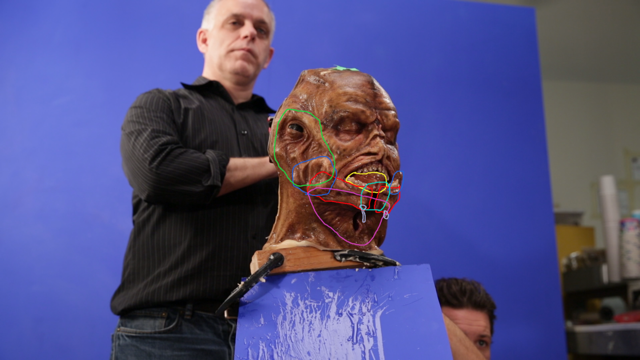
Each of the team took turns puppeteering the face while watching video playback on a large monitor. It was challenging to perform the mandibles, and turn the head the proper direction in time — a task often split between two people puppeteering together. One for the mandibles and jaw, the other for the head. We found that it was easier to let the humanoid inner-jaw move naturally as the mandibles opened, rather than work them separately, as the action seemed more connected. The original makeup for Brian was made out of foam latex, and the insert head out of silicone. The paint job was exquisitely matched to the master, and looked lovely covered in UltraSlime drool (applied by our VFX producer Christopher Brown – who also called the timing count.) Multiple takes were shot for every setup in one afternoon.
Mixing Brian
The lineup was the most difficult part.
We shot all of the images at 30FPS, as opposed to the 24FPS we were going to deliver to the client. We knew that it would be impossible to exactly match the onscreen performance, so it was necessary to re-time the footage, shortening some frames, and extending others smoothly to match the movement. At times we flopped elements, and combined takes with 2D morphing. Rough composites assured us we had enough footage, and one day later the entire setup for filming was struck.
There was a lot of rotoscope involved. It was important to trace regions of each image, so that the blend between the two sources could be managed on a region-by-region basis. One adjustment did not work for all sections, so as much control as we could have in rotoscope was appreciated. This work was done by the increasingly capable dMFX team in Vancouver — actual makeup artists training to work in photogrammetry, 3D modeling, and compositing. Their eye for detail and form was a great asset in the digital realm.
Once again the 3D tracking team matched a 3D camera and model to the retimed footage. The images were stabilized from these cameras, and transferred to the 3D cameras in the plate photography setup — a trick I learned from a Cinefex article on Harry Potter. With all of the footage now moving under the original camera, the tricky section of blending all the edges between the two setups began.
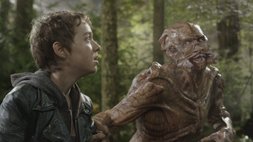
For those of you following along, this is where the word “proprietary” gets used. Simply put, multiple points along the surface of the insert footage were tracked, then the same points tracked on the original footage, after which proprietary tools matched the points and off-the-shelf plug ins warped the footage to line up. At the time no single tool existed to do it, so we wrote our own glue code for Hemlock Grove. The next set of proprietary tricks split the image into different frequencies, and blended the detail from one image, over the color and mid-level detail of the other — grafting them together like merging two decks of cards.
The drool was also intensified. Specular highlights were brought up, and more slime photographed for additional drips. Brian seems to have a drool problem, or is extremely hungry.
The final touch to the mandible composites was to take small facial movements, from a squint, or wiggle in the actor’s flesh, and translate that movement into the new sections. This process dates all the way back to the melting face from the TV series FRINGE, and allows another level of reality to obscure the blending line between the two halves. No better way to convince somebody that something is alive, than to puppeteer it with live movement — even if it is after the fact.
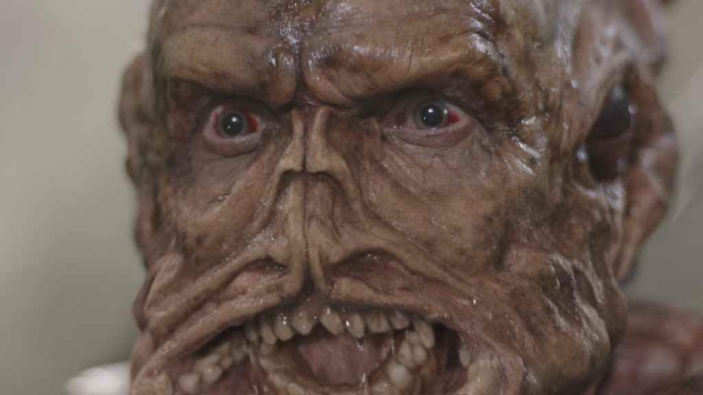
The results were very gratifying, and successful beyond our hopes. You visually assume that the inner jaw is operated by the actor, until you analyze how thin it is, and that the performer could not have worn that piece. One very nice side effect of the actor on-set, was the visible breath he had in the shot, which tied in nicely with our additions — a benefit of shooting in Canada, one might guess. In the end, very few takes were required to finish the face composites, and the client was excited with the result.
A Leg Up On Brian
It was time to try out the quad legs. Truthfully, replacing legs on a character is one of the staples of this series, normally handled by a VFX company. There are a lot of skitters, and the hybrid makeup, CGI leg extension goes on all the time — so this only focuses on the matter for Brian, a very short-lived character in the series. (If you want to know more about Skitters in general, and how practical effects enhanced them, follow this link.)
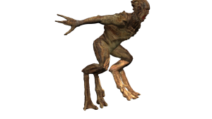
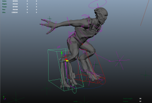
The Zbrush sculpt of Brian was exported to Maya software, which was then lit and shaded to match the plates, and positioned to camera. Fortuitously, the director chose to keep Brian relatively still in these shots, so simpler methods of rigging the legs would suffice.
To make the digit-leg look more stable, it was necessary to shorten the upper leg of the filmed footage. This was either done with image warping, or the upper leg was replaced with the CGI sculpted piece, and the rest of the legs rendered in Mental Ray. Many shots only required a still image that was warped to fit the knee and standing position, but for more complex movement, the knee joint was tracked and projected to the proper position in 3D space, and used to drive the root of the leg joints. So through a combination of a CGI render, a little matte painting, and some good old-fashioned compositing, Brian got new legs.
The quad legs looked silly. Thus the double legs were used instead. (So much for the earlier design.) Were we not restricted by the fact that it needed to intercut with shots that were dMFX-free, then other options could have been explored. Best to stay with the approved design.
Disarming Brian
Any retrospective of Brian would not be complete without bringing up the spring-loaded arm. It was truly an unusual feature, and it is fun to imagine what discussions went around the table at the pitch meeting for it. Nonetheless, there was a scene with Brian 12 feet from the other actor — who was miming holding a gun, and having it taken from him, after which the actor playing Brian mimed grasping the gun, and turning it around to threaten the regular actor on the series (it’s a show about alien monsters invading the world, so there is lots of gunplay.)
To complicate the matter, the action of extending the arm takes place in less than one second.
The weapon was simply done with a few photographs of the prop, animated to fit into the hands of the actors. The arm was solved by sculpting a closed position for the arm in Zbrush, and an extended section based on the length of the physically sculpted arm. The final sculpt stretched a full 6 feet in-scale to the actor. Since the action happens so quickly, it was best to rapidly scale the fully extended arm 200% for a few frames. It took a couple of tries, but worked for the single shot that was required. Standard compositing paint-back techniques filled in the area that was originally covered by the real arm. In conjunction with the practical mandibles, and CGI legs, Brian was quite an unusual character. Hopefully a memorable one.
Here is the entire scene, you might be able to see which shots were affected, and which were left as photographed. You may also compare the limits that practical effects impose, vs what CGI can easily break. At times, the limits of physical objects keep the filmmakers honest, and at times they must be pushed. You be the judge.
The End of Brian
This character is an excellent example of how Computer Generated Imagery, and practical visual effects working together can solve a complex problem. Far too often the decision to replace a practical effect is driven by ease of decision, rather than planning. There is also the thought that doing so is “simple” and that it is also more cost effective. Although the cost can at times be lower for a visual effect, vs a practical one, it is not the default condition. The best way to serve a concept is often the same best way to keep costs down. Planning.
It was great to have a client that understood the advantages of the approach, and allowed us to play in their sandbox with these currently “unorthodox” methods. They were not doggedly committed to a single approach, but constantly sought the best method for the image they wanted to make. With the time available for the post-production, this was by far the most effective tool for the job. Sometimes it is good to embrace the eccentricities of reality, and sacrifice a little control to nature.
Because of the successful results of this method, Brian was not the only character, or dMFX gag in the last season of Falling Skies to rely heavily on practical effects. As the team grew in ability, the number of practical effects in use actually increased. The use of digital tools did not eliminate the need for sculpted pieces of rubber, and actors, but empowered their return. However, those are stories for the next installments of:
THE DIGITAL MAKEUP CHRONICLES!
AG


Article lead-in was repaired, as an earlier version was inadvertently published. Currently showing the final copy. Sorry for the inconvenience!