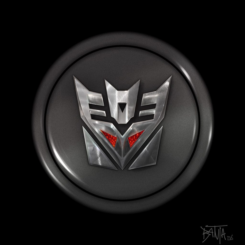
 An Idea On Its Own
During the production of Transformers: The Movie, I was asked to submit some ideas for poster designs, and other concepts to sell the motion picture. I knew it was a Michael Bay film, and that he had a love for fast cars, scantily clad perfect women, and shiny metal objects, and I hoped to bring a fresh perspective — considering I had seen nothing of the film, or its designs — that was easy.
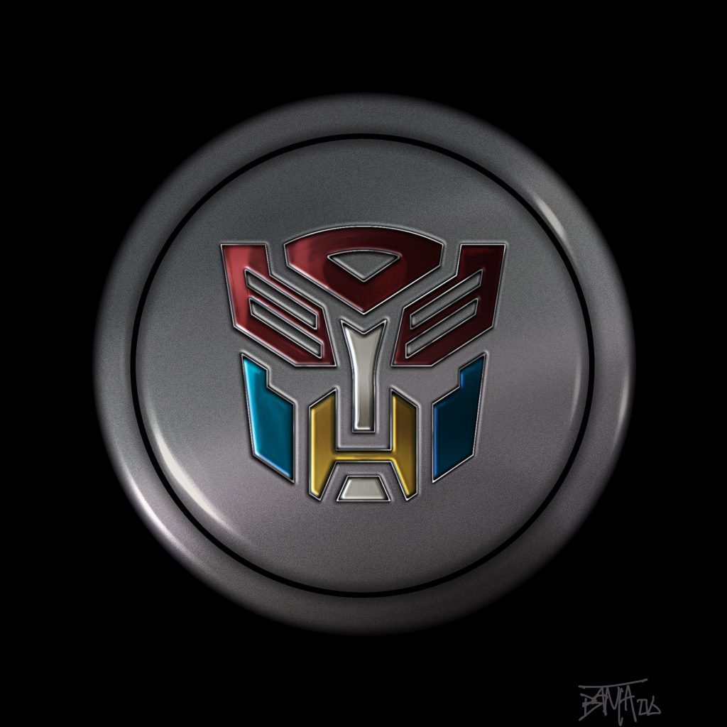
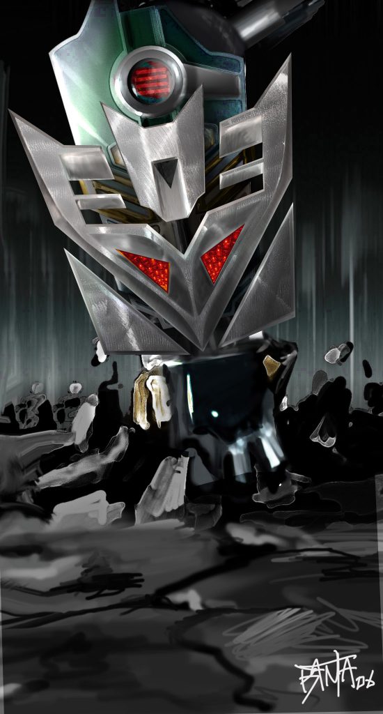
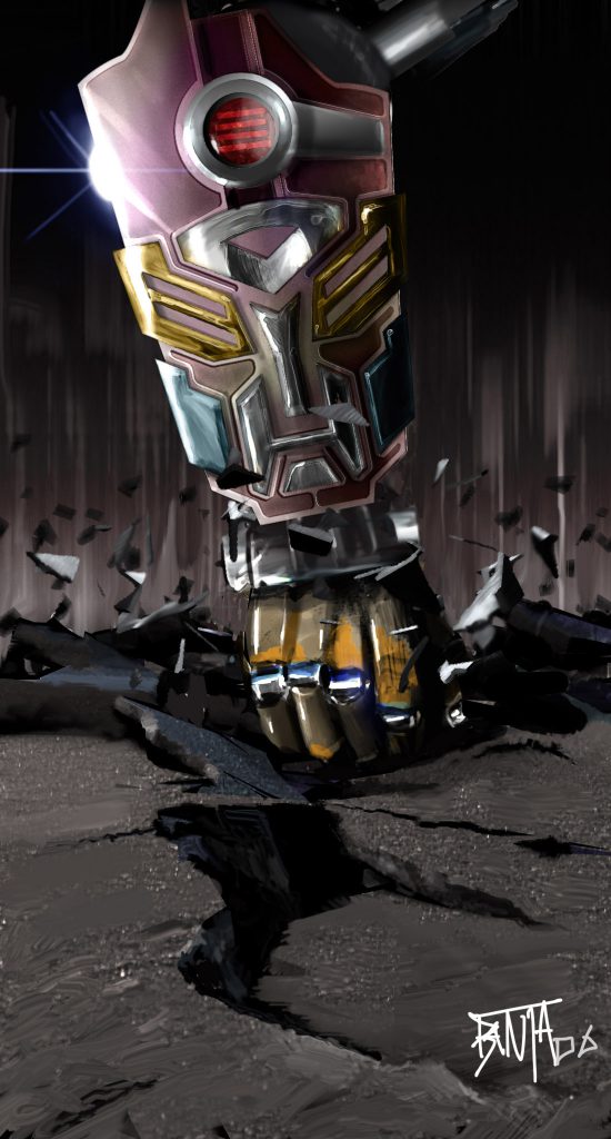
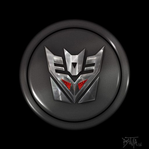
I was concerned that the look of the film’s logo and advertising would be grungy, rusty, block letters — which is the actual direction the franchise chose. I wanted to emphasize that the robots were among us, beautiful, and innocuous. I wanted to suggest the aesthetics of cars in materials and lighting, and the sense of power the giant robots have on their environment.
Admittedly it was fairly ambitious, and with no direction other than “make some designs,” I spent several hours photographing reference, and pushing out some initial thumbnails — which are laid-out here.
Although not the final direction, I am still a fan of the aesthetic — a retro-60’s high-polish car finish. There were even keychains, and hubcaps I designed that looked like fan-ish add ons to actual cars, so that the robots could identify each other while blending into human pop-culture.
Alas the designs were not to be, but are another Lost Concept for your amusement.
AG
